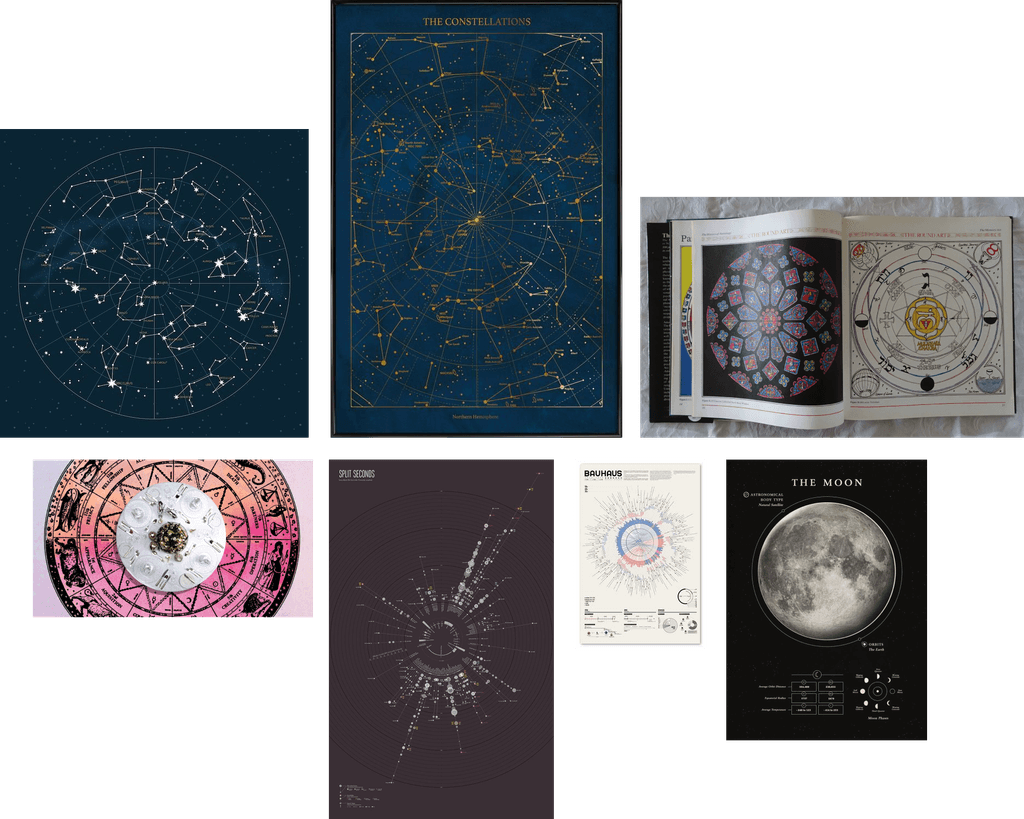
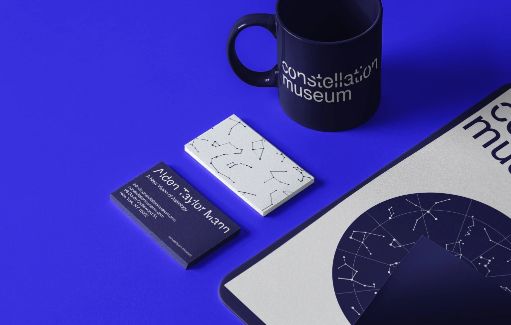
This branding project was created as part of my Advanced Typography class. I designed a branding for a fake museum and took inspiration from the colorful illustrative graphics from the book The Round Art: The Astrology of Time and Space by Alden Taylor Mann.
This branding project was created as part of my Advanced Typography class. I designed a branding for a fake museum and took inspiration from the colorful illustrative graphics from the book The Round Art: The Astrology of Time and Space by Alden Taylor Mann.
The Constellation Museum showcases the field of astronomy and the history of constellation stars in various mediums: virtual reality, observatories, and interactive space. The museum divides into different exhibitions depending on the types of constellations. Each exhibition allows the audience to learn more about their constellation. The museum is set in dark blue lighting, allowing the audience to be in the moment and gain the full vivid experience. The goal of this museum is to bring the audience a greater understanding of horoscopes, constellations, and astrology through an immersive experience amongst the stars that exist in space.
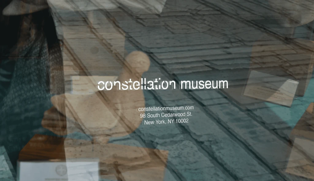
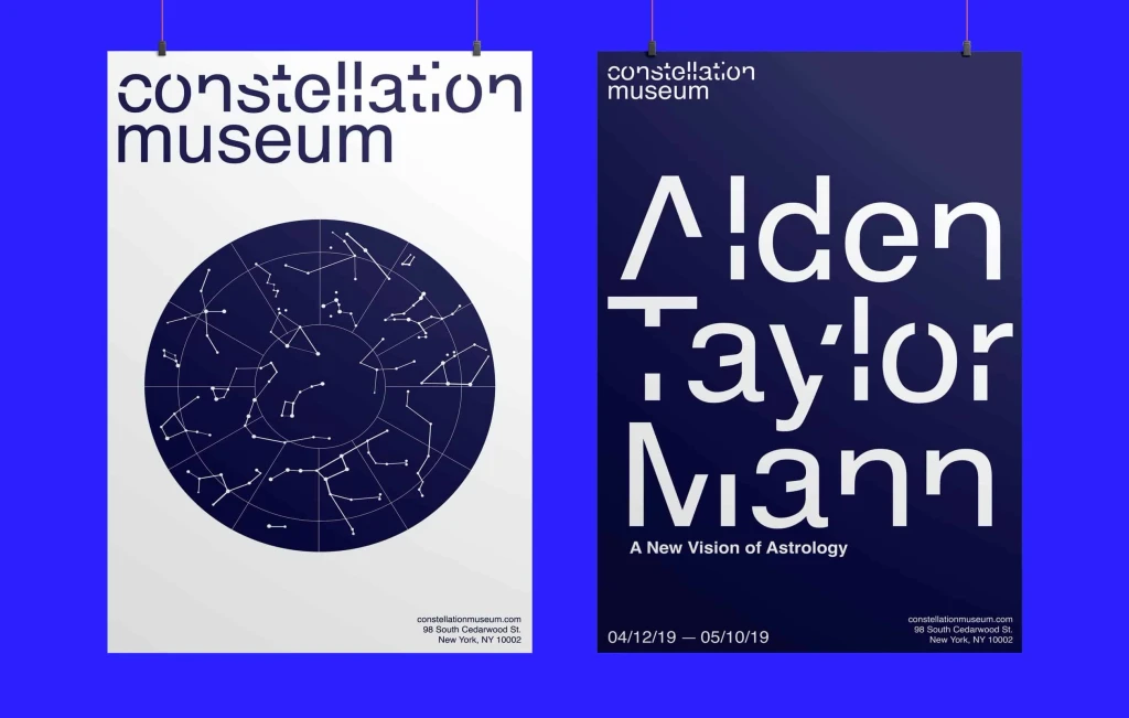
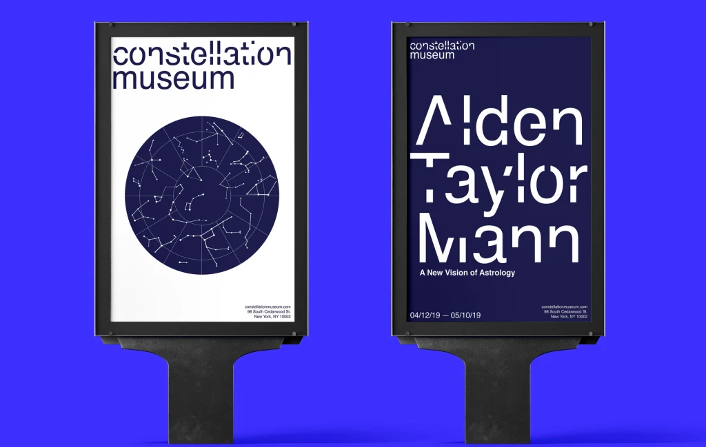
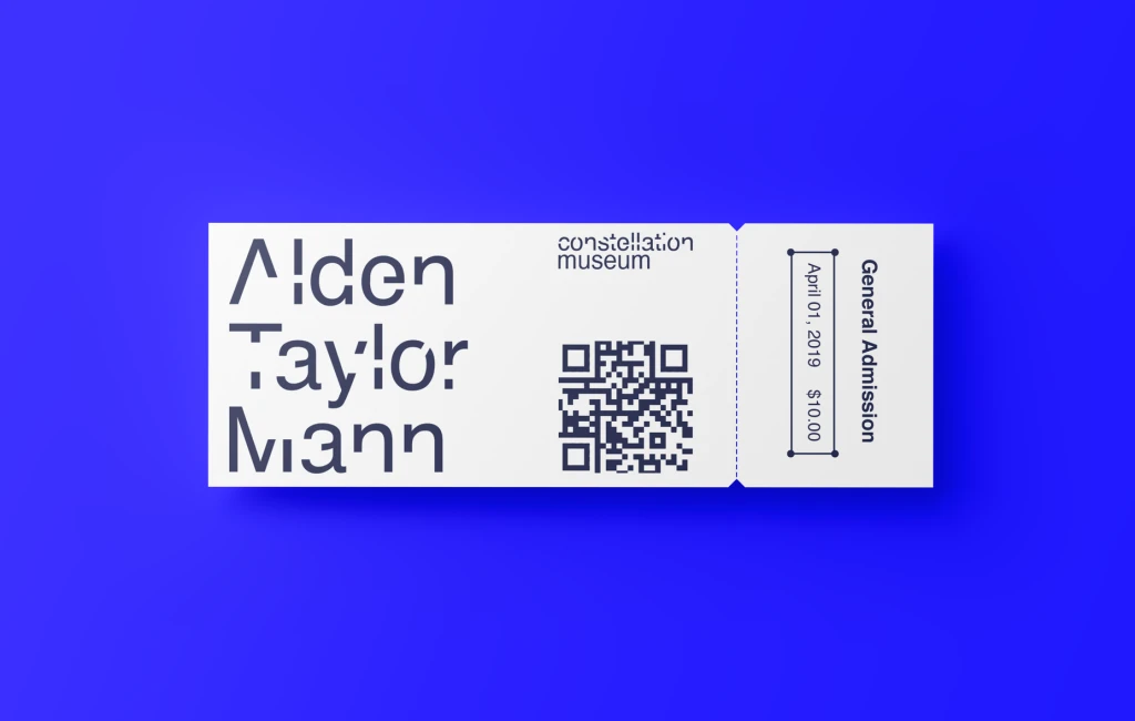
The Constellation Museum is designed with unique cuts in the typeface, Helvetica. I designed the typeface to make the connection between constellations and astrology more obvious. Although the letters are cut, the letters are still recognizable to the audience. The logo is in lowercase letters to give an informal and welcoming impression. The typographic design cuts are also applied in the exhibition posters to give a stronger and unified connection between the exhibition showcase and the medium.
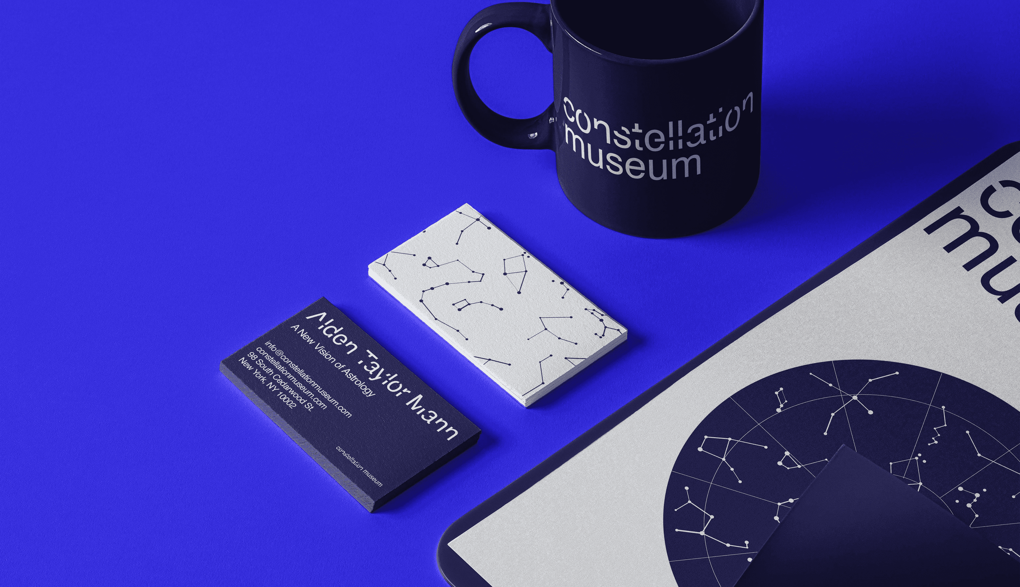
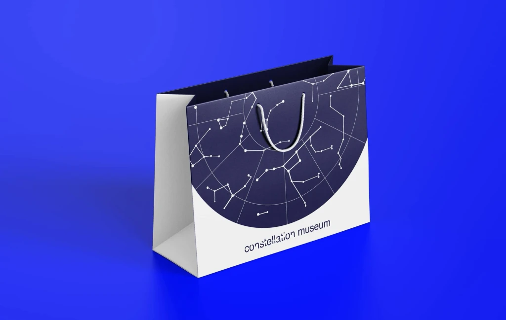
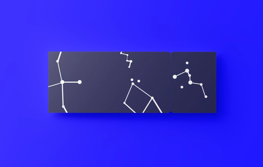
In branding the Constellation Museum, I wanted to make the marketing materials cohesive in the designs of the tickets, gift bags, and posters. Making all mockups cohesive gave a stronger brand identity. I also wanted to emphasize the constellation stars literally by using illustrations and vectors. This allowed me to also understand the identity of the Constellation Museum in the big picture.
