Z by HP: Adobe Max Conference 2022
Z by HP: Adobe Max Conference 2022
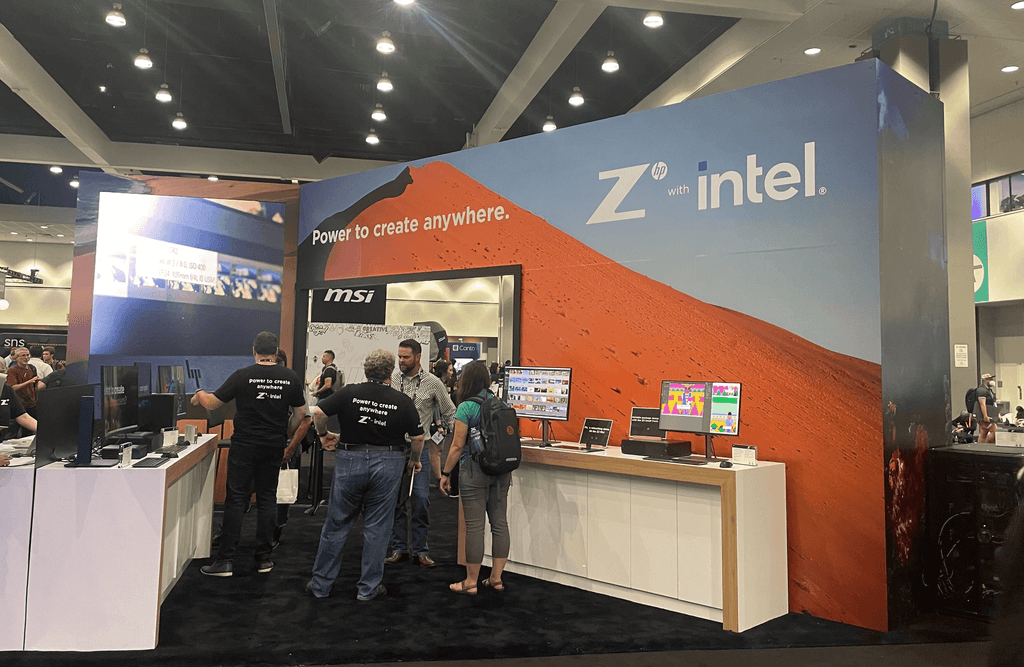
Maximizing Z by HP’s stationed booth to feature its products through Jody Macdonald and Jonathan Bird's photography.
Maximizing Z by HP’s stationed booth to feature its products through Jody Macdonald and Jonathan Bird's photography.
Designing Z by HP's stationed booth featuring Jody Macdonald and Jonathan Bird's photography at the annual Adobe Max Conference.
Designing Z by HP's stationed booth featuring Jody Macdonald and Jonathan Bird's photography at the annual Adobe Max Conference.
MY ROLE
Campaign Development
Visual Imagery
Layout
AGENCY
Giant Spoon LLC.
Junior Designer
TOOLS
Photoshop
Illustrator
TIMELINE
4 weeks


OVERVIEW
OVERVIEW
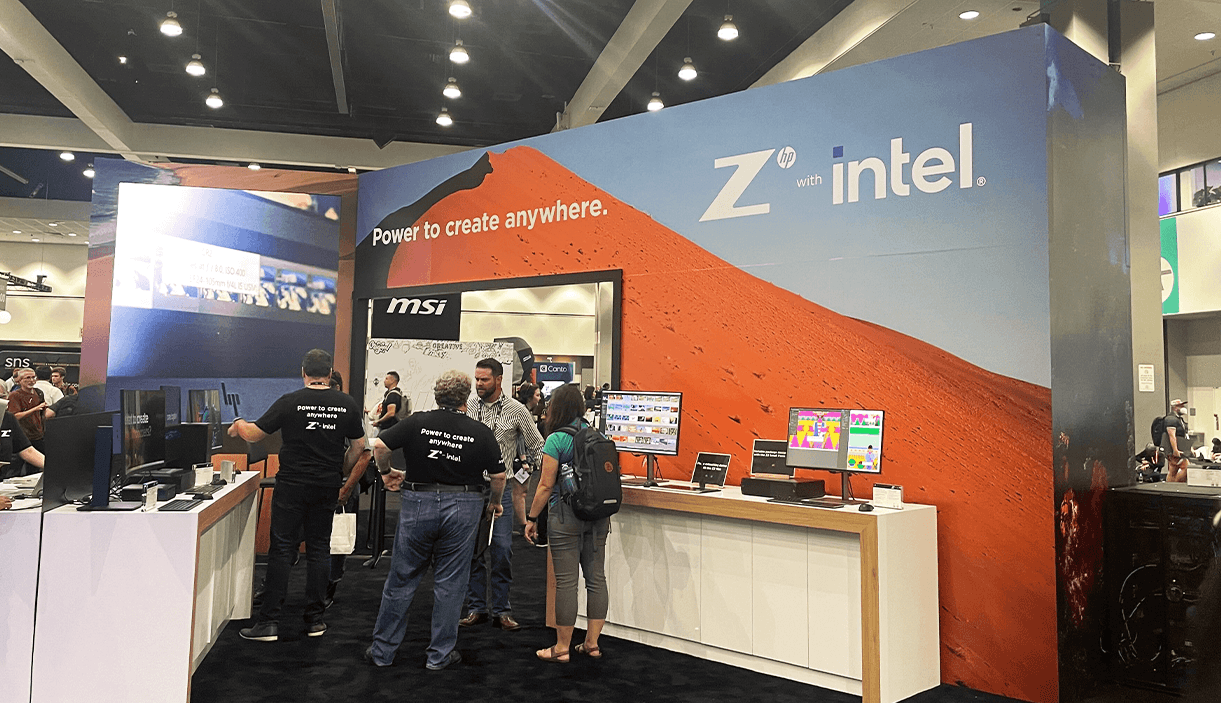
With more than 200+ sessions and various speakers, I helped create Z by HP's stationed booth showcasing Jody Macdonald and Jonathan Bird's photography. Using their elegant photography, my team and I designed the wall panels in the booth space.
With more than 200+ sessions and various speakers, I helped create Z by HP's stationed booth showcasing Jody Macdonald and Jonathan Bird's photography. Using their elegant photography, my team and I designed the wall panels in the booth space.
IMAGE ASSETS
IMAGE ASSETS
Photography Exploration
Photography Exploration
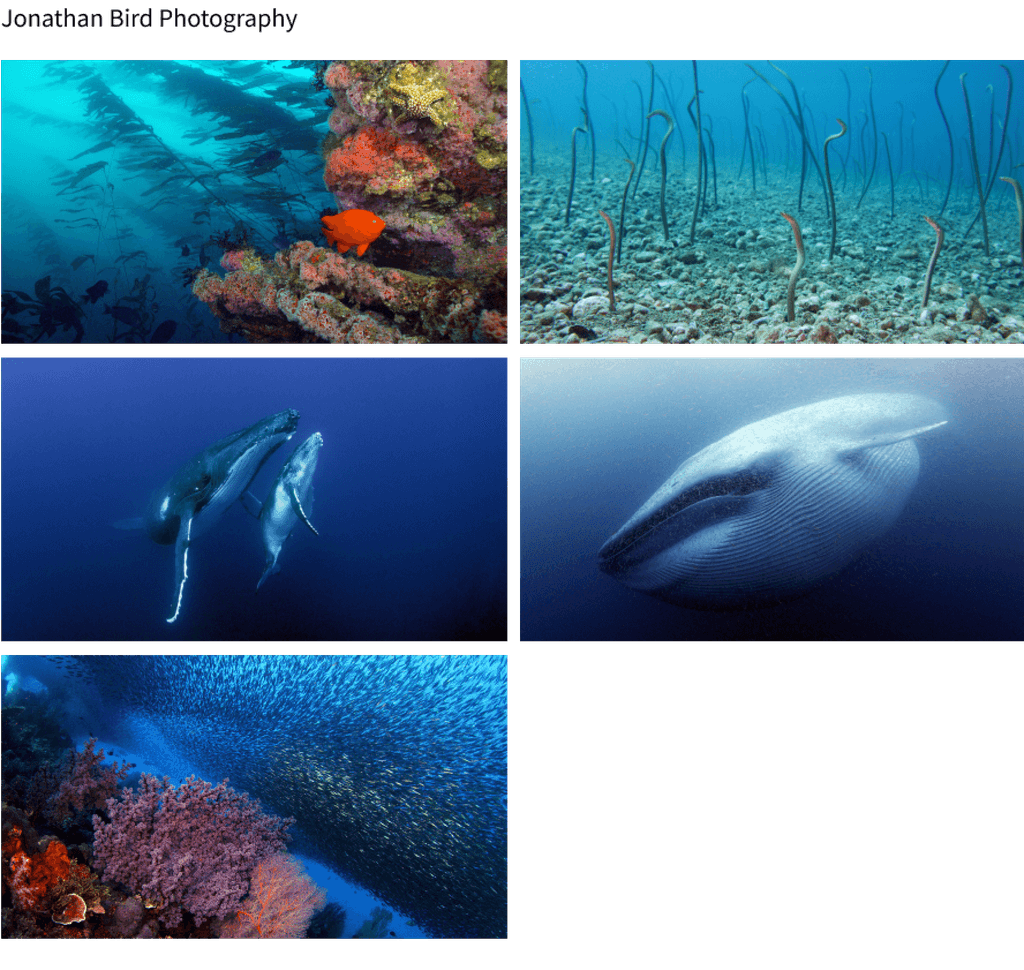
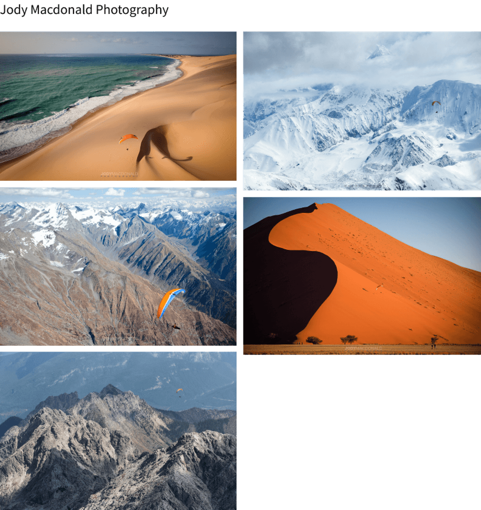
In exploring the possible images for the booth's wall panels, I gathered various images from Jonathan Bird and Jody Macdonald's photography.
In exploring the possible images for the booth's wall panels, I gathered various images from Jonathan Bird and Jody Macdonald's photography.




ROUND 1 DESIGNS
ROUND 1 DESIGNS
Exploring the arrangement of text and images
Exploring the arrangement of text and images
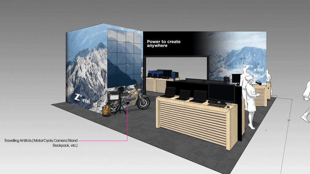
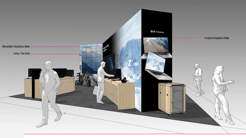
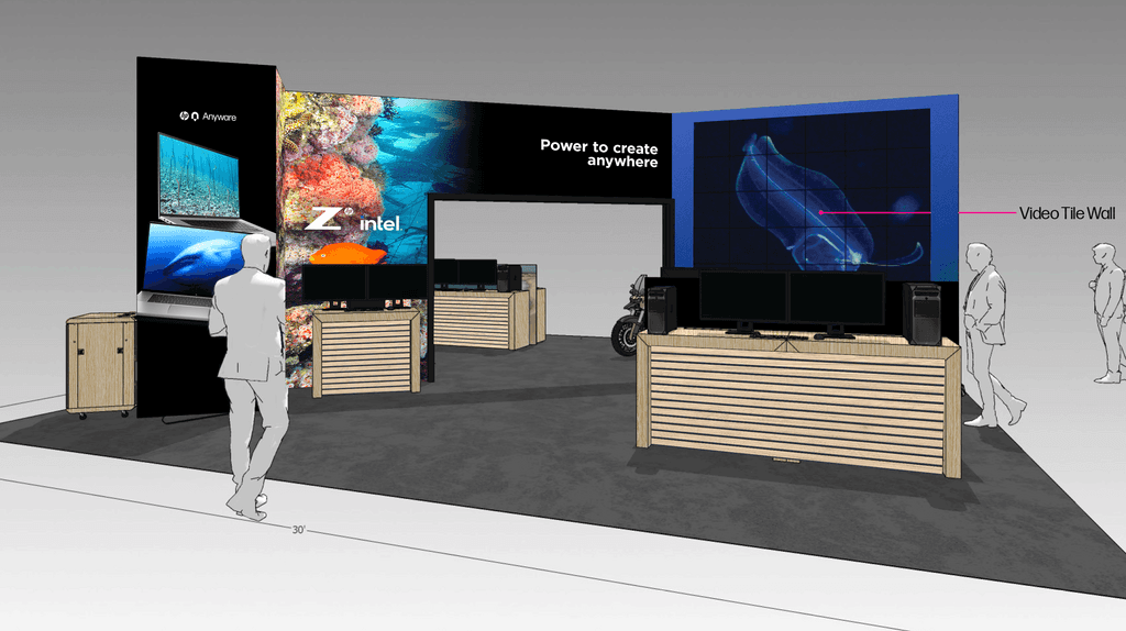
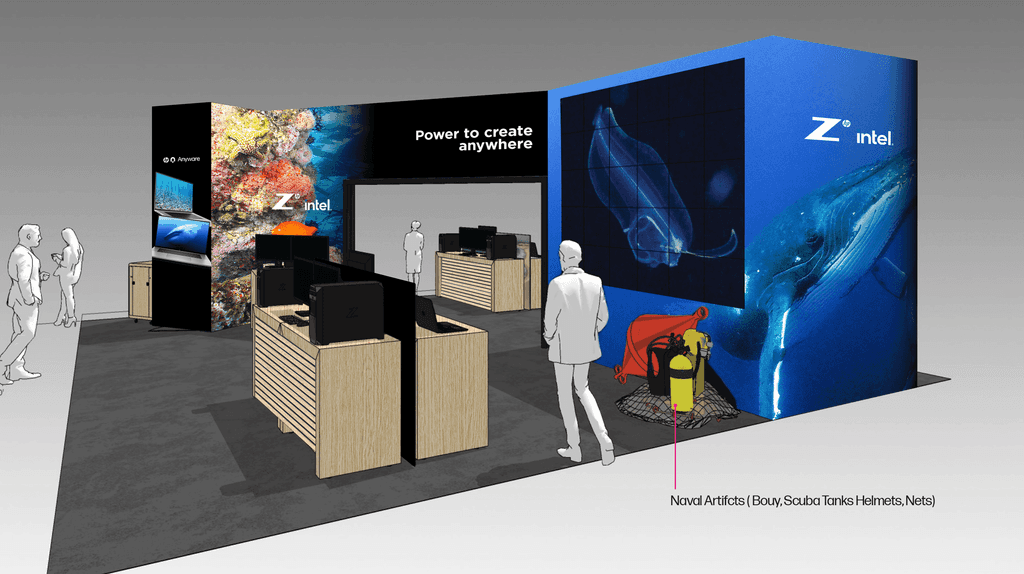
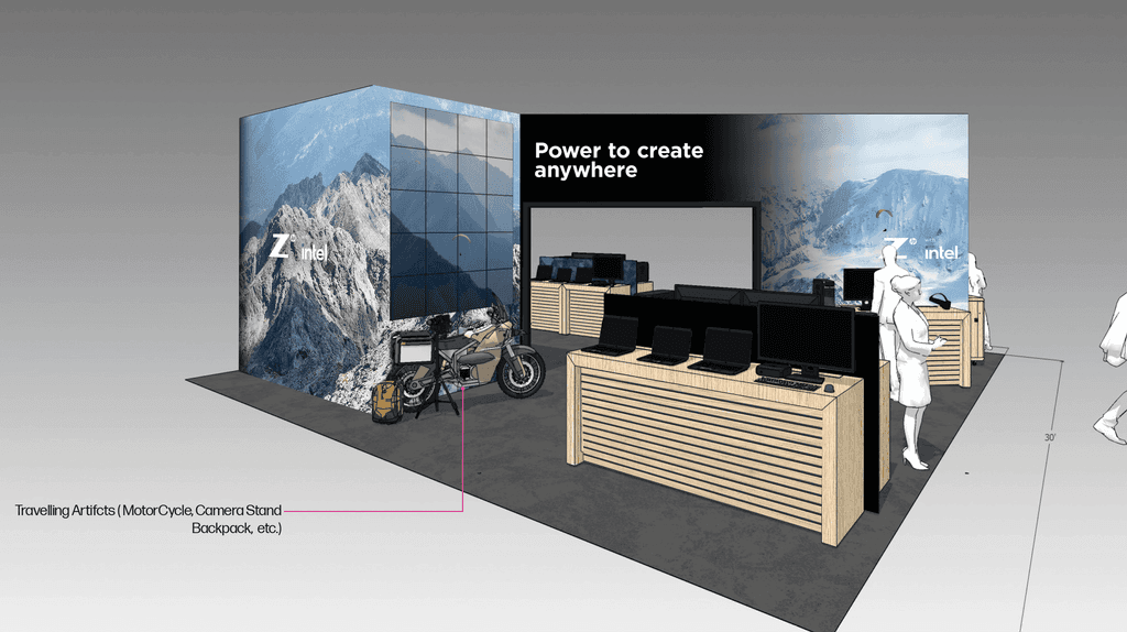
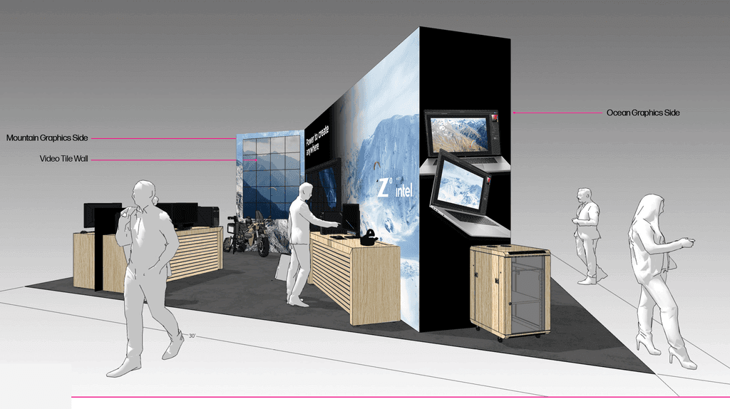
For the first round of designs, I integrated Jody Macdonald's photography on one side of the panel and Jonathan Bird's photography on the other side of the wall panel. Keeping Z by HP's brand guidelines, I incorporated gradients of black to make the images on each panel transition seamlessly.
For the first round of designs, I integrated Jody Macdonald's photography on one side of the panel and Jonathan Bird's photography on the other side of the wall panel. Keeping Z by HP's brand guidelines, I incorporated gradients of black to make the images on each panel transition seamlessly.


Front View
Front View


Front Side View
Front Side View


Back View
Back View


Back Side View
Back Side View
ROUND 2 DESIGNS
ROUND 2 DESIGNS
After receiving feedback
After receiving feedback
Upon receiving feedback from our client, the client wanted more emphasis on Jonathan Bird and Jody Macdonald's photography. Hence, I extended the main image to cover 3 panels instead of 2 panels to highlight the photography. To still feature Z by HP's laptop product, I kept one of the side wall panels to feature its laptop product.
Upon receiving feedback from our client, the client wanted more emphasis on Jonathan Bird and Jody Macdonald's photography. Hence, I extended the main image to cover 3 panels instead of 2 panels to highlight the photography. To still feature Z by HP's laptop product, I kept one of the side wall panels to feature its laptop product.


Front View
Front View


Front Side View
Front Side View
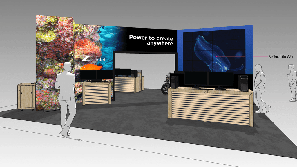


Back View
Back View
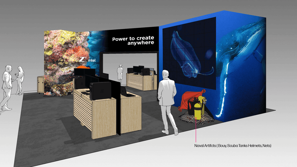


Back Side View
Back Side View
ROUND 3 DESIGNS
ROUND 3 DESIGNS
Final Iteration
Final Iteration
From additional feedback and iterations, the client wanted Jonathan Bird and Jody Macdonald's photography to be joined together more seamlessly so that the front and back panels could be more cohesive as one. From this feedback, I challenged myself to find photographs that have similar color tones. As a result, I made the images bleed over 2 or 3 panels and added a gradient of black on the edges between the images. Through this process, we were able to lock our designs for production.
From additional feedback and iterations, the client wanted Jonathan Bird and Jody Macdonald's photography to be joined together more seamlessly so that the front and back panels could be more cohesive as one. From this feedback, I challenged myself to find photographs that have similar color tones. As a result, I made the images bleed over 2 or 3 panels and added a gradient of black on the edges between the images. Through this process, we were able to lock our designs for production.
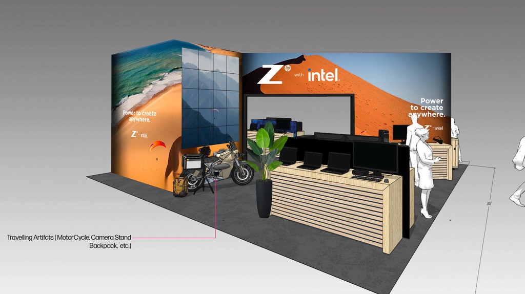


Front View
Front View
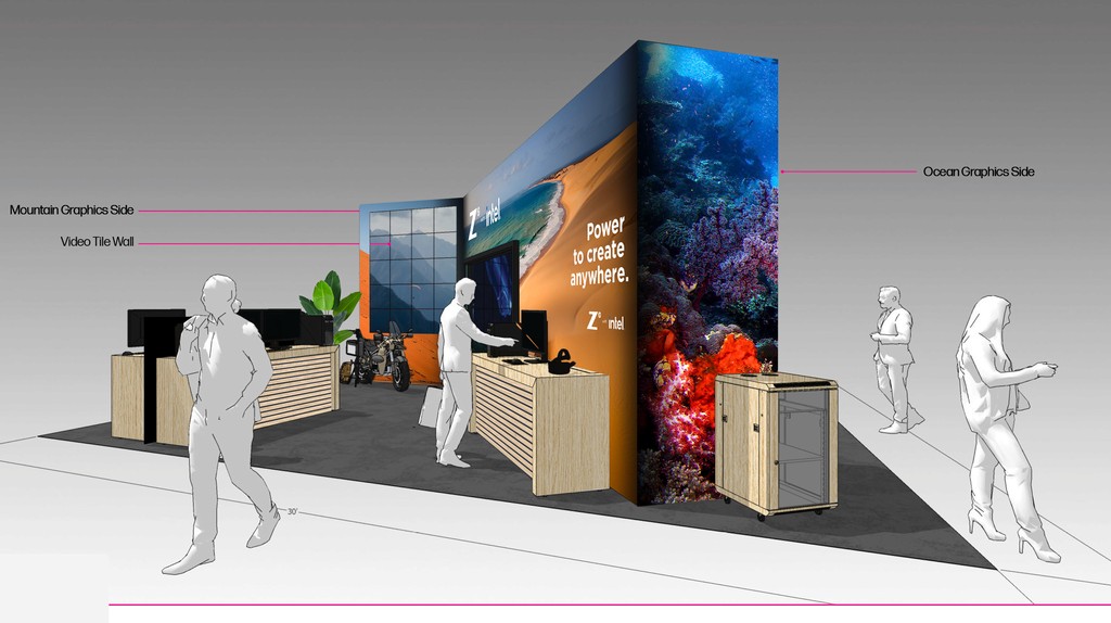


Front Side View
Front Side View
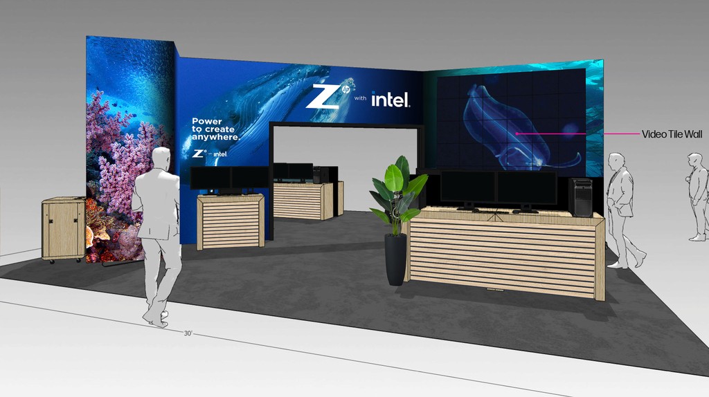


Back View
Back View
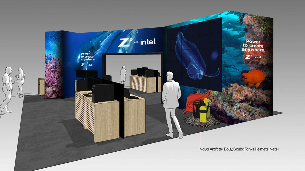


Back Side View
Back Side View
