
TIMELINE
January 2025 - March 2025
3 Months
TEAM
4 Product Designers
1 Senior Researcher
SKILLS
Usability Testing, Interaction Design, Trust & Safety, Design Strategy
TLDR
OVERVIEW
Hiya launched an AI-powered calling app with features like spam protection, AI call summaries, automatic calendar event creation, and Incognito mode. Adoption of core AI features lagged because users didn't always understand what the AI was doing or whether it was working.
ROLE
I led usability research, synthesized findings into 4 design recommendations, and presented them to Hiya's UX team. Those recommendations directly influenced the product roadmap. I collaborated cross-functionally with designers, researchers, and engineers throughout the process.
IMPACT
Delivered 4 actionable design recommendations that directly informed product roadmap decisions for AI-powered calling features.
Reduced user hesitation in privacy-sensitive flows through clear indicators of AI activity and privacy state.
Increased confidence for users to act on scam warnings, privacy controls, and AI-generated events by clarifying trust signals and system behavior.
What We Were Working Within
Design decisions had to work within a product that was already live. That meant dealing with cross-platform inconsistencies between Android and iOS, privacy-sensitive requirements, and limited time for longitudinal research. We stuck to moderated usability sessions because of the timeline.


Success Criteria
My design goals were to reduce user hesitation, make it clearer when AI was active, strengthen trust in privacy features, and help users successfully complete key interactions like spam alerts, event creation, and Incognito mode.

Likert Scale Responses
I began with 8 exploratory questions.
I started with 8 exploratory questions covering onboarding, feature discovery, AI interactions, and calling workflows. After aligning with the UX team, we narrowed it down to the 4 questions most critical to adoption and trust.
Can users discover and understand Hiya’s core AI features, including scam detection, event creation, and incognito mode?
Did users know when AI was active and feel confident relying on it?
Can users complete in-call tasks (answering, managing, and summarizing calls) without hesitation or confusion?
Do users trust Hiya to protect their privacy and flag scam calls appropriately?
Translating Our Findings
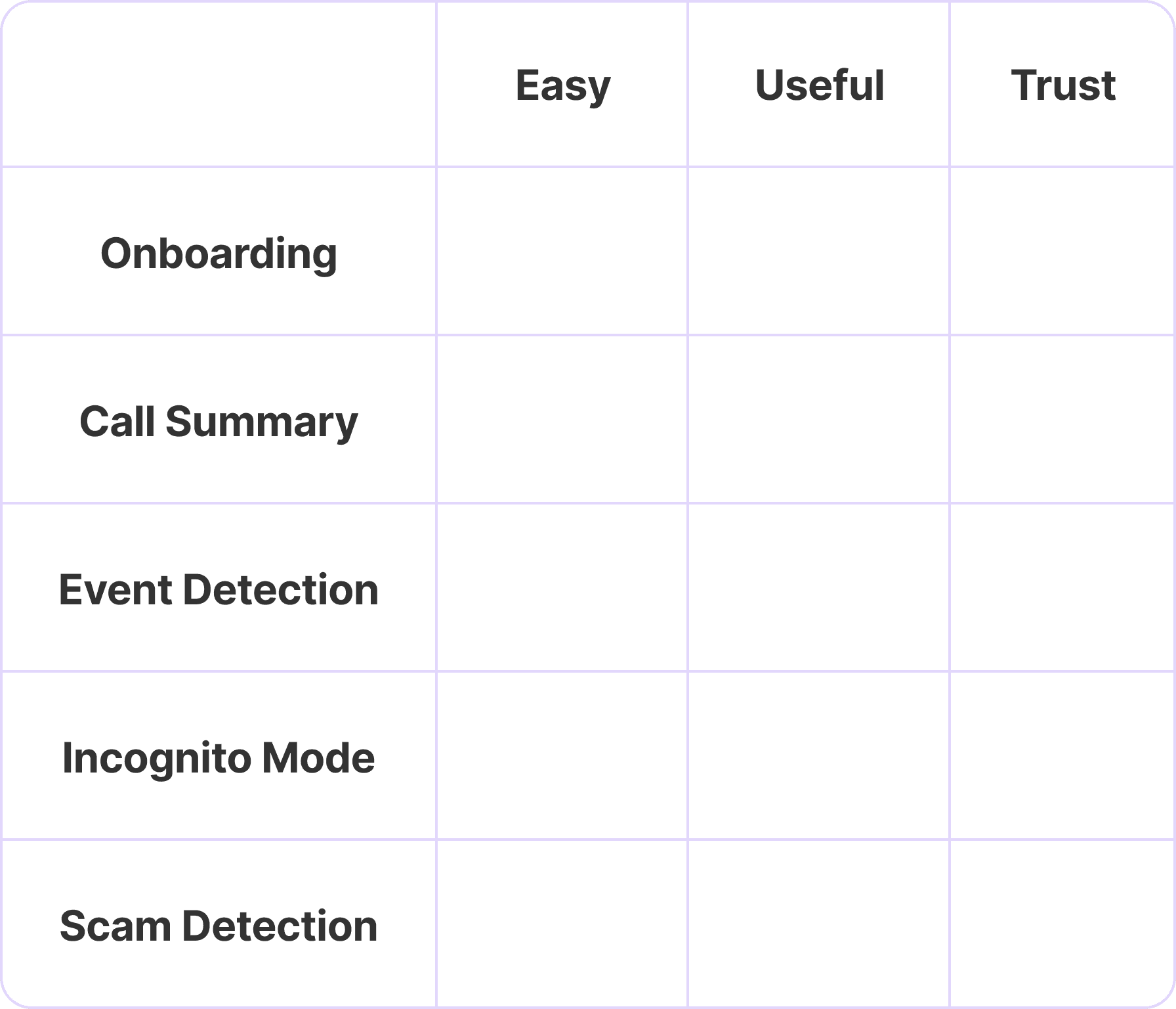
I screened over 30 participants and ran 10+ moderated usability sessions. Findings were synthesized through affinity mapping and severity scoring, with Likert scale responses used to quantify user confidence across key features.

Affinity Mapping User Feedback
INSIGHT 1
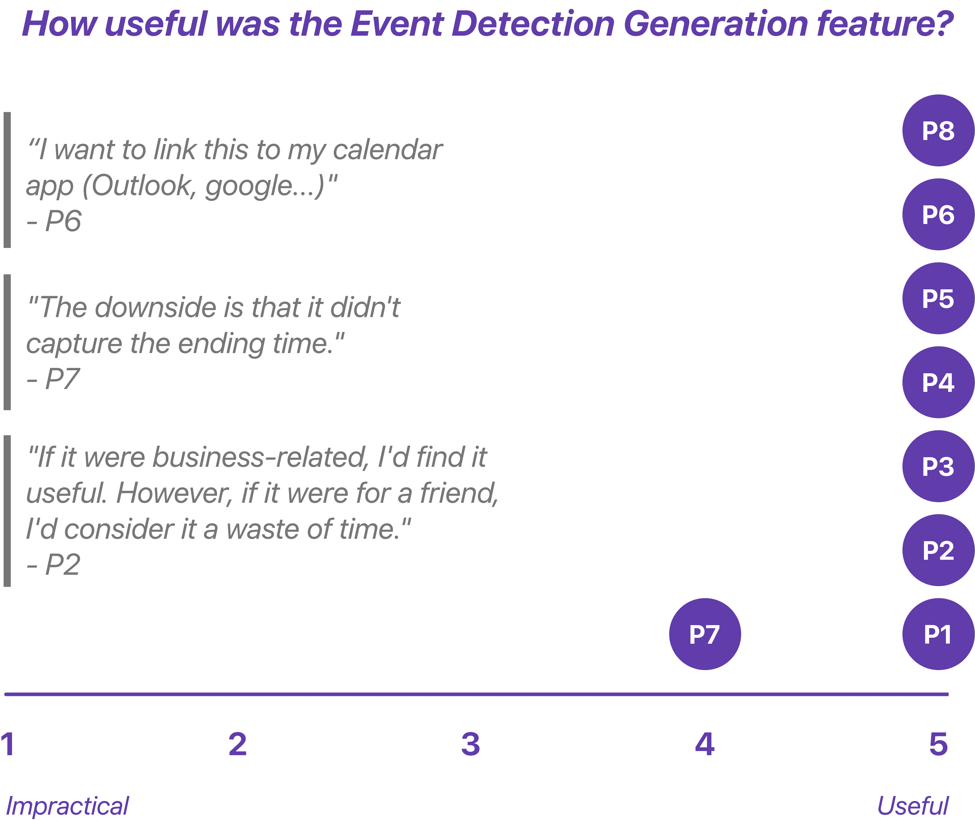
Calendar event detection rated 4.9 out of 5 for usefulness, but professionals couldn't change end times, add guests, or sync to Google or Outlook. That gap between how useful it felt and how limited it actually was prevented real adoption.

Design Recommendation
BEFORE
Confusing and rigid event creation reduced clarity and control.
The calendar icon looked tappable, misleading people into unplanned detours.
Events showed only start times, leaving meetings open-ended and uneditable.
All events defaulted to the system calendar, frustrating users loyal to Google or Outlook.
AFTER
Users regained control and confidence through flexible event creation.
Added color-coded event states [Unconfirmed] & [Confirmed] for instant clarity.
Integrated a review and edit step to adjust titles, times, and details before saving.
Introduced third-party calendar integration so users could save events in their preferred calendar.
INSIGHT 2
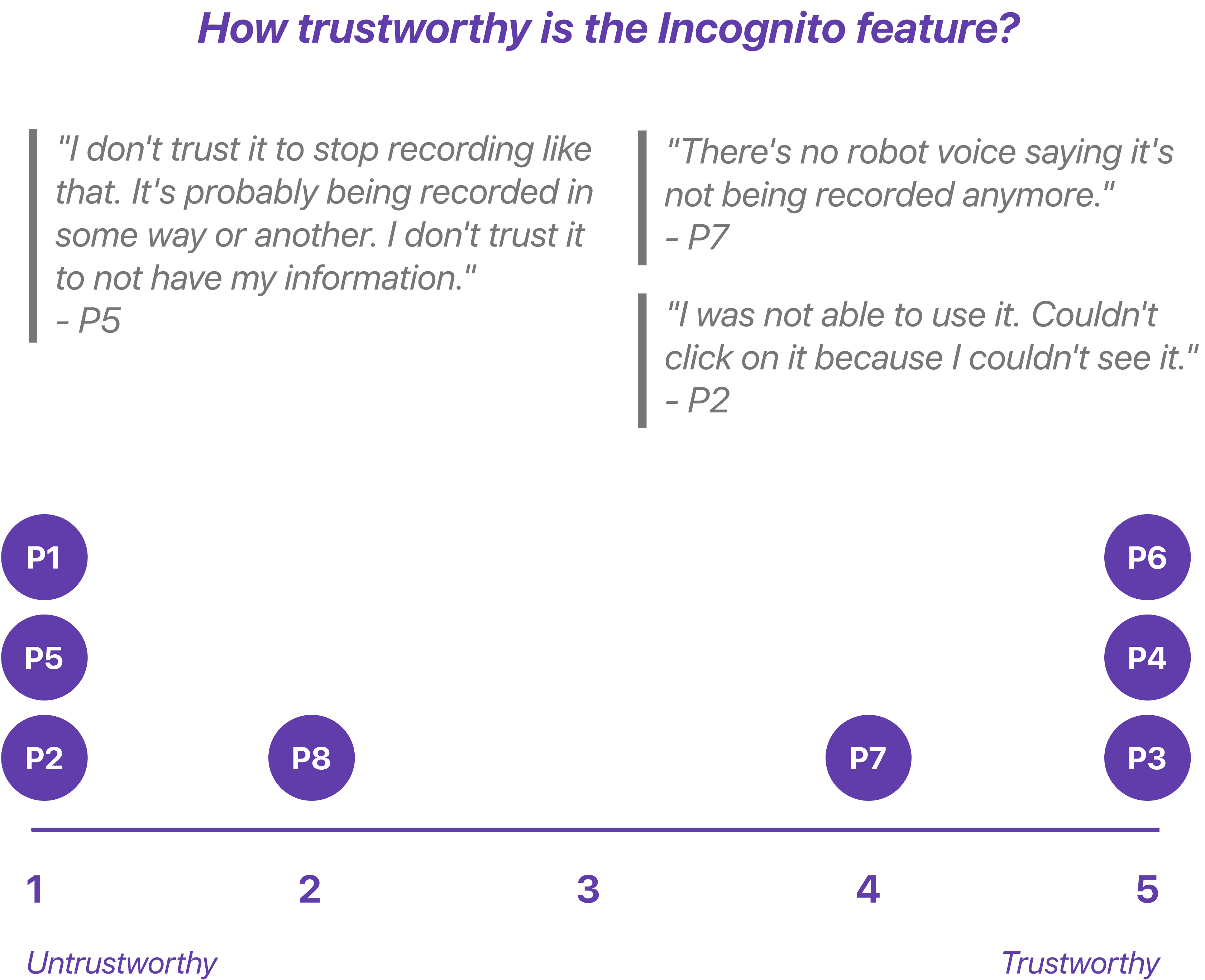
6 of 8 users found Incognito mode but only 4 trusted it. The feature behaved differently depending on whether you were on speaker or handset and there was no confirmation after the call that privacy protections had actually been active.

Design Recommendation
BEFORE
Inconsistent behavior led to missing signals and distrust.
Discovery varied by speaker or handset mode, making activation unreliable.
No confirmation indicated whether recording had stopped, leaving users unsure the feature even worked.
AFTER
Clear confirmations turned uncertainty into trust.
The onboarding intro explains how Incognito works and what protections it provides.
When active, users hear a verbal confirmation and see a visual pop-up confirming privacy is enabled.
INSIGHT 3
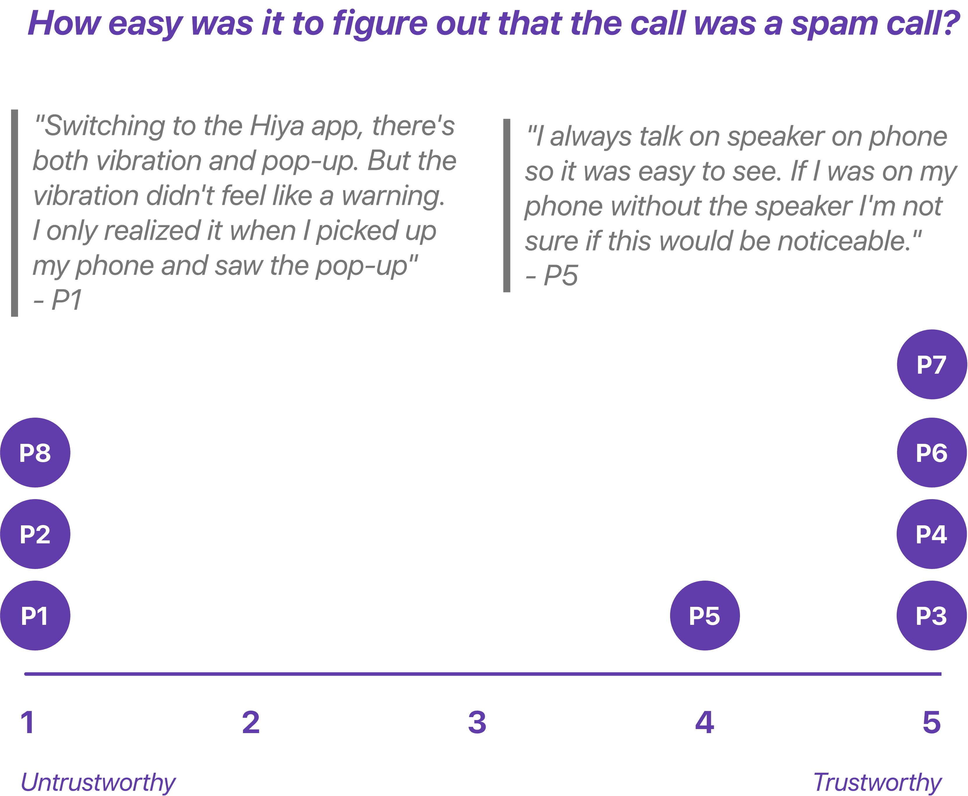
Spam alerts were easy to miss and hard to trust. Visual and haptic cues went unnoticed and without any explanation for why a call was flagged, users couldn't confidently act on the warning. They knew something was off but didn't have enough context to trust it.

Design Recommendation
BEFORE
Weak visibility made critical warnings easy to miss.
Weak visibility made critical warnings easy to miss. The “Potential Scam Call” label was unnoticed below the number.
Users were forced to choose [Accept] or [Decline] with no context.
Subtle haptics failed to interrupt attention and AI gave no explanation for flagging spam → reducing trust.
AFTER
Alerts became visible and impossible to miss.
A pre-call banner with strong haptics and a distinct tone commands attention before connection.
A bold warning screen states risk and gives users time to decide safely.
An AI explainer surfaces the reasoning behind alerts: “We flagged this number based on reported spam patterns.”
Reflection
Hiya's app was newly launched and several technical issues surfaced during testing including onboarding failures that blocked user progress. I partnered closely with engineers to surface these early so fixes could ship without delaying research. The initial test plan was also too long for a single session so I worked with the team to condense it while keeping the most important insights intact.
Hiya is currently only available in the U.S. but international expansion will require rethinking more than just language. In Japan phone scams often impersonate government agencies so the visual language of authority and warning needs to feel institutionally credible rather than alarming. In Korea spam patterns skew toward financial fraud with a high volume of robocalls which shifts the threshold for what deserves a full-screen warning versus a subtle indicator. Trust is culturally constructed and designing for it means designing for the specific fears and expectations of each context.
These are 3 of the key insights from the usability testing. For the full findings and recommendations, reach out directly.
