
TIMELINE
Jan 2026 - Jun 2026
6 Months
TEAM
4 Product Designers
SKILLS
User Research, Brand Identity, Motion Design, UX Design, Interaction Design, Vibe Coding
TLDR
OVERVIEW
Bloodworks Northwest supplies blood to more than 90 hospitals across Washington and Oregon. In 2024, collections fell short of demand by over 10,000 units and the gap continues to grow bigger as older donors age. They asked us to redesign the donor center. But our research pointed us somewhere else entirely…
ROLE
I co-led user research and designed the brand system that held every touchpoint together. My design contribution includes a motion graphics poster built in Cavalry, a two part educational game using Claude Code and Swift, and social media posts.
IMPACT
67% increase in engagement rate against benchmark
400% increase in click-throughs to the eligibility flow from the same number of viewers
35% of viewers were new to Bloodworks against an 8.6% benchmark
We spent a day at the donor center and found nothing to fix
Bloodworks wanted the donation experience itself to feel less intimidating, with less needle anxiety and staff interactions that felt more personal and reassuring. I co-led 12 interviews with 18 to 28 year olds and spent a day inside a donor center, where the staff were already warm and the people who walked in nervous walked out fine. Almost nobody described the experience as the hard part.
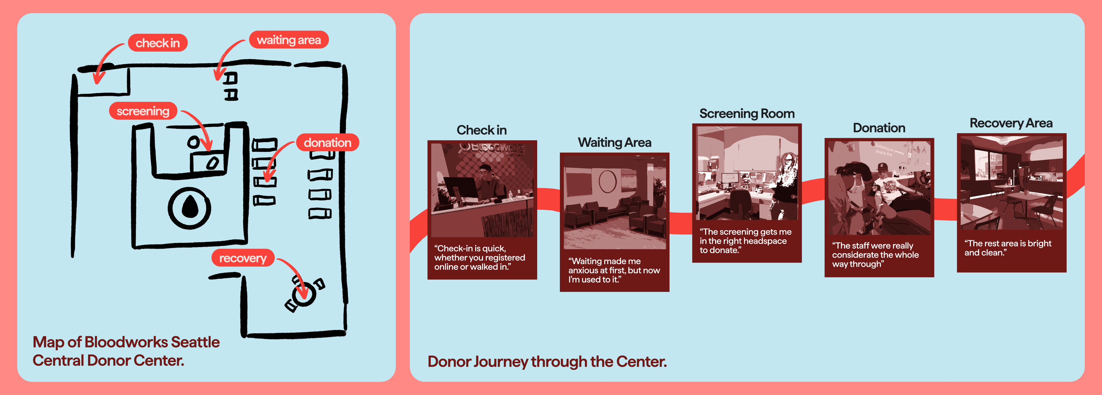
The problem was never donating blood. It was becoming a donor in the first place.
Every non-donor I interviewed supported blood donation and none of them could share why they still hadn't gone. It wasn't that they were against blood donation but they just never had a reason to go now instead of someday.


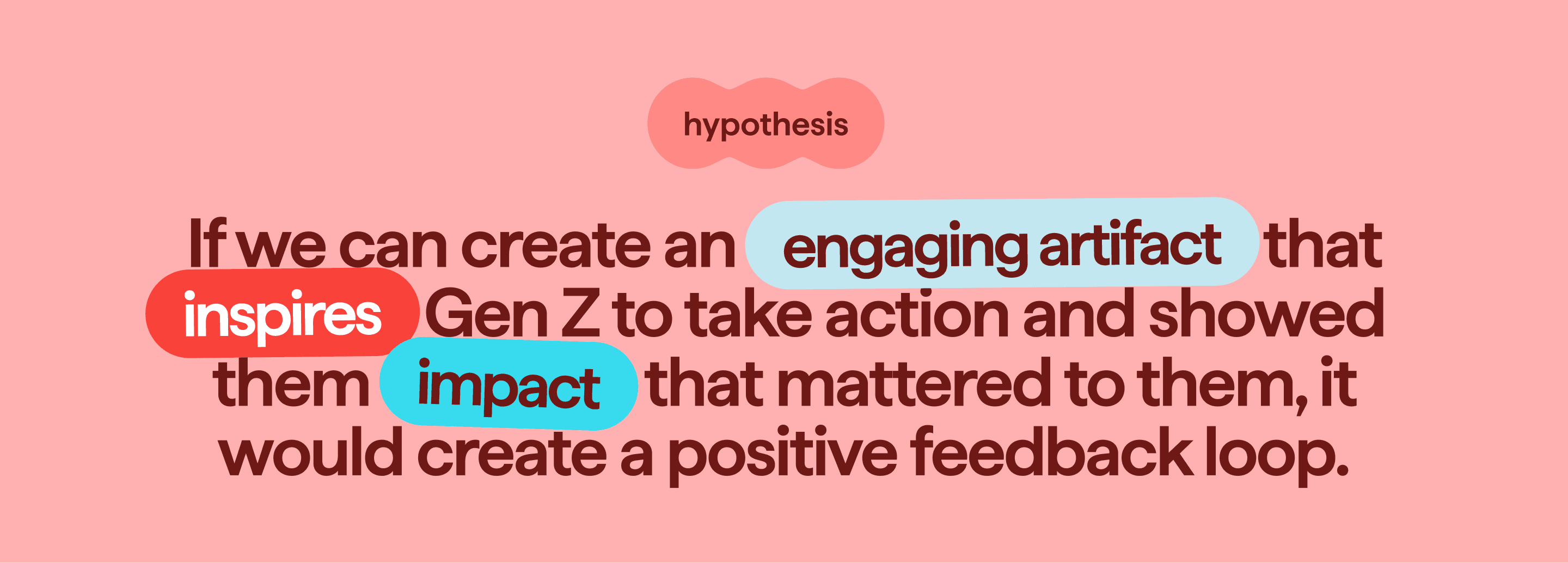
Our hypothesis before building anything
Our research surfaced opportunities across the whole donor lifecycle but we narrowed our focus to first-time donors the pre-donation process because getting someone to their first donation was the core problem so the loop is what comes after this.
4 guiding principles: Entice, Encourage, Educate, and Act so Gen Z shows up to donate
These guiding principles became the four stages of the ecosystem.

Building a sister brand for the Gen Z donors Bloodworks didn't have yet
We built 6 moodboards for a workshop with Bloodworks' Marketing Lead and Director of Product Design to map directions on a scale from friendly to edgy. Bloodworks wanted to maintain their brand mission: to be inclusive and welcoming without going too retro or grunge that it stopped feeling like Bloodworks.

Brand Identity and System
It had to work on campus displays and phone screens, so I built it as a system that includes little character illustrations that are inspired by blood cells, sans-serif type, and colors that feel friendly and not clinical or childish.

Motion Graphics Poster to Entice
This motion graphics poster stops Gen Z for a second. It gives them facts about Bloodworks and ends on "Find out your blood type for free." I made it as motion instead of a flat poster so it can live on campus screens and in feeds, which is where Gen Z actually are.
Instagram Stories to Encourage
This story kit gives Bloodworks a way to post that Gen Z will actually watch. I kept each slide to one idea because anything more and people swipe past the posts.
Eligibility Quiz & Mythbuster Game to Educate
People told us they didn't donate because they were scared of going all the way to a center and getting turned away. This is a two part interaction built in Claude Code and Swift.
ELIGIBILITY QUIZ
First is a quick eligibility checker and it tells you if you can donate before you make the trip. If it states that you are ineligible, it tells you when you can come back instead of turning you away.
MYTHBUSTER GAME
People said the old materials were boring and dry. If you're not sure yet, it flows into a Mythbuster Game where you pop blood cells to knock down the myths that scare people off.