Support Systems | Accessibility | Social Impact
Adults and their aging parents struggle to maintain meaningful emotional connections despite wanting to stay close, especially when family bonds aren't naturally strong. Busy schedules and technological barriers create friction in daily communication, leading to gradual emotional distance between family members.
I led the design of the iPhone widget extension from concept to completion—creating low and high-fidelity prototypes that enhanced overall usability while contributing components to our design system. I was integral to the entire product development lifecycle, collaborating across all phases from initial planning through final implementation.
IOS Widget & Hardware Device
Passion Project
Contribution
User Research
Concept Development
Wireframing
Prototyping
Usability Testing
Motion Design
Team
Yuri Kawada
Gily Yu
Yit Chung
Yechan Choi
Tools
FigJam
Figma
Timeline
10 weeks
A hardware-software integrated communication product designed for both adults and their aging parents, allowing users to interact in a personal way, fostering closer connections.
Discover
We narrowed our broad problem scope through secondary research, surveys, and user interviews to ensure potential market direction.

Reviewed 6 papers and 7+ forums to explore how adults and parents maintain long-distance relationships.
Designed a 20-question survey, collecting 60 responses from full-time workers in their 20s living away from parents.
Conducted semi-structured interviews with 5 adults and 4 parents to understand how they stay connected despite distance and busy schedules.
Define
Adults struggle to balance time constraints and make meaningful connections, leading to guilt and unfulfilling interactions.
Aging parents and adults yearn for closeness, but parents hesitate to be burdensome and adults have difficulty to initiate conversations.
Digital communication falls short in replacing shared physical experiences which impacts daily moments and important life events.
The differences in communication styles create friction, which makes consistent communication difficult.
Define

The Overwhelmed Daughter
Amy, 35
As Amy grows older, she cherishes her family but feels guilty that she's not spending enough time with her mom and struggles to maintain consistent communication due to busy work schedules.

The Digital Newcomer
Agnes, 78
Agnes longs for deeper connections with her daughter, Amy but hesitates to burden her during their monthly visits. Her unfamiliarity with technology and fear of being burdensome creates a communication barrier and leaving important conversations unsaid.
Develop
Deriving from our research, we set characteristics and requirements that our solution could provide for adults and their parents before diving into our ideation and sketching phase.
Parents
Accommodate varying levels of tech comfort and physical capabilities
Provide gentle guidance without feeling overwhelming
Seamless interactions even with limited technical skills
Shared Goals
Foster authentic conversations that don't feel forced or scheduled
Familiar interaction patterns to minimize learning curve
Allow for asymmetric communication patterns (different time zone & frequency)
Adults
Fit into existing daily routines without adding cognitive load
Allow meaningful connection opportunities in brief and manageable moments
Work within existing device ecosystem (no new apps to download or manage)
Setting clear design goals kept us focused on creating genuine moments of connection. Looking back, we learned that 'effortless' meant different things to different users - future research could better define these varying interpretations.
Develop
Our team of 4 conducted an ideation session, sketching and evaluating concepts against our core design goals: effortless interaction, personalization, and genuine connection.


🎥 Warm Watchparties
A remote control allowing live reactions during shared TV viewing, like sending confetti effects. While personalized, it wasn't low effort or genuine.

🍽️ Feeling Plate
A smart surface converting daily actions (like placing keys) into automated family messages. Although it was effortless, it lacked personalization and authenticity.

✏️ Pocket Pad
A pocket-sized device for handwritten notes to loved ones. This met our goals of being effortless, personalized, and genuine. This concept was selected for development.
Develop
We highlighted the Pocket Pad’s key features for both aging parents and tech-savvy adults, focusing on simplicity and accessibility.
Speaking with both user groups taught us that 'staying connected' meant different things to different generations. In future iterations, we'd like to explore how these preferences evolve as tech-savvy adults become aging parents themselves.
Develop
The user flow combines 3 user flows we made before iterating and creating the final design.

Design
Users were confused about the “Send to” screen, which only appeared after writing a message. Adults also expressed challenges managing an additional device alongside their phones due to their busy lives.
How might we better streamline the Pocket Pad to minimize confusion and integrate seamlessly into the busy lives of adults?
Early testing revealed that our assumptions about emoji importance were incorrect. Users valued personal expression over preset reactions. If given more time, we’d like to see this idea better implemented, and measure if the feature could be retooled to empathize better with users.
Design
To integrate Pocket Pad into the lives of adults, we designed a dual-interface solution: a physical device for parents focused on accessibility and an iPhone app extension for tech-savvy adults. Testing with 2 parents and 3 adults guided our refinements for high-fidelity prototype.
The Pocket Pad Device on Parent
We noticed that the personalized emoji feature was not favored by the users due to it being high effort and low satisfaction, so the design was refreshed to utilize default iOS emojis with a library already familiar with users.
The Pocket Pad Device on Parent
Usability testing with parents revealed confusion and difficulty on initial startup and the prompts screen. We’ve addressed these issues by adding hints and instructions throughout the design and making the prompt cards more visually accessible.
The Pocket Pad on iPhone for Adults
Testing revealed mixed feedback on emojis but strong user preference for prompts across both parent and child groups. We maintained consistent prompt dialogue in both interfaces to align with this user response.
The Pocket Pad on iPhone for Adults
Usability testing revealed users struggled with navigation clarity - particularly differentiating between photo and notes sections on the home screen. We improved interface legibility by adding contextual hints and streamlining the design to create clear user pathways.
Design
In thinking about the physical Pocket Pad device, we have also 3D modeled our device in real dimensions.
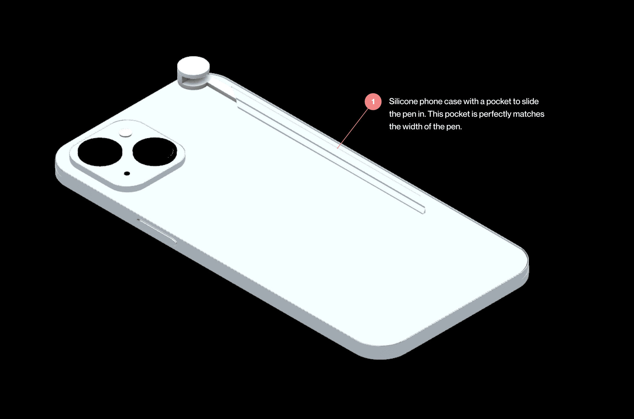
The phone case design integrates a secure pen holder, preventing loss while maintaining a slim, seamless profile.
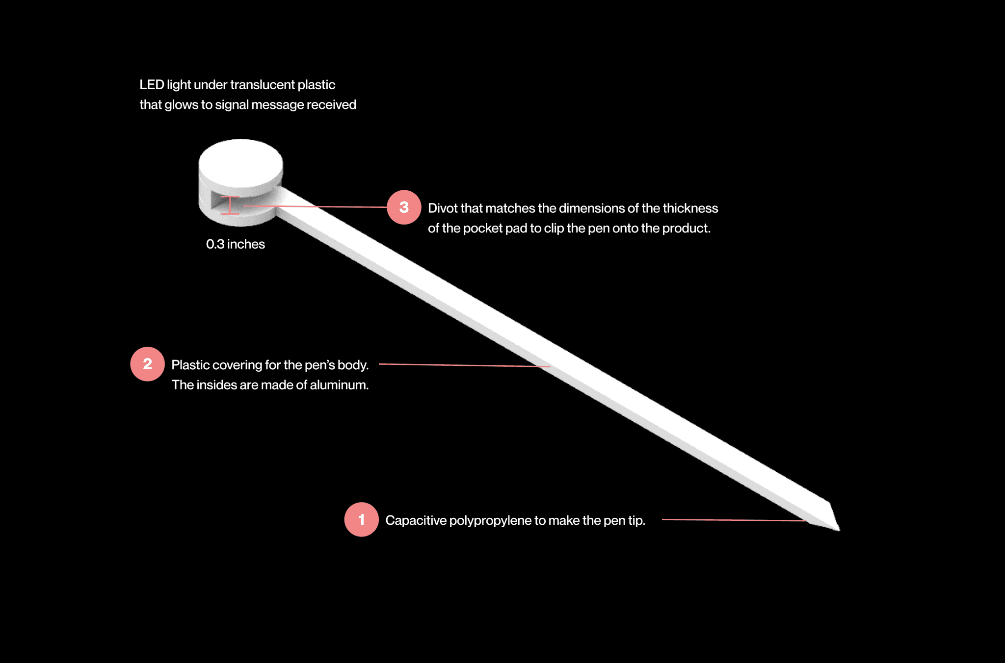
The pen features a specialized crevice fitting the Pocket Pad and a circular tip for easy removal. When messages arrive, the tip glows as a notification.
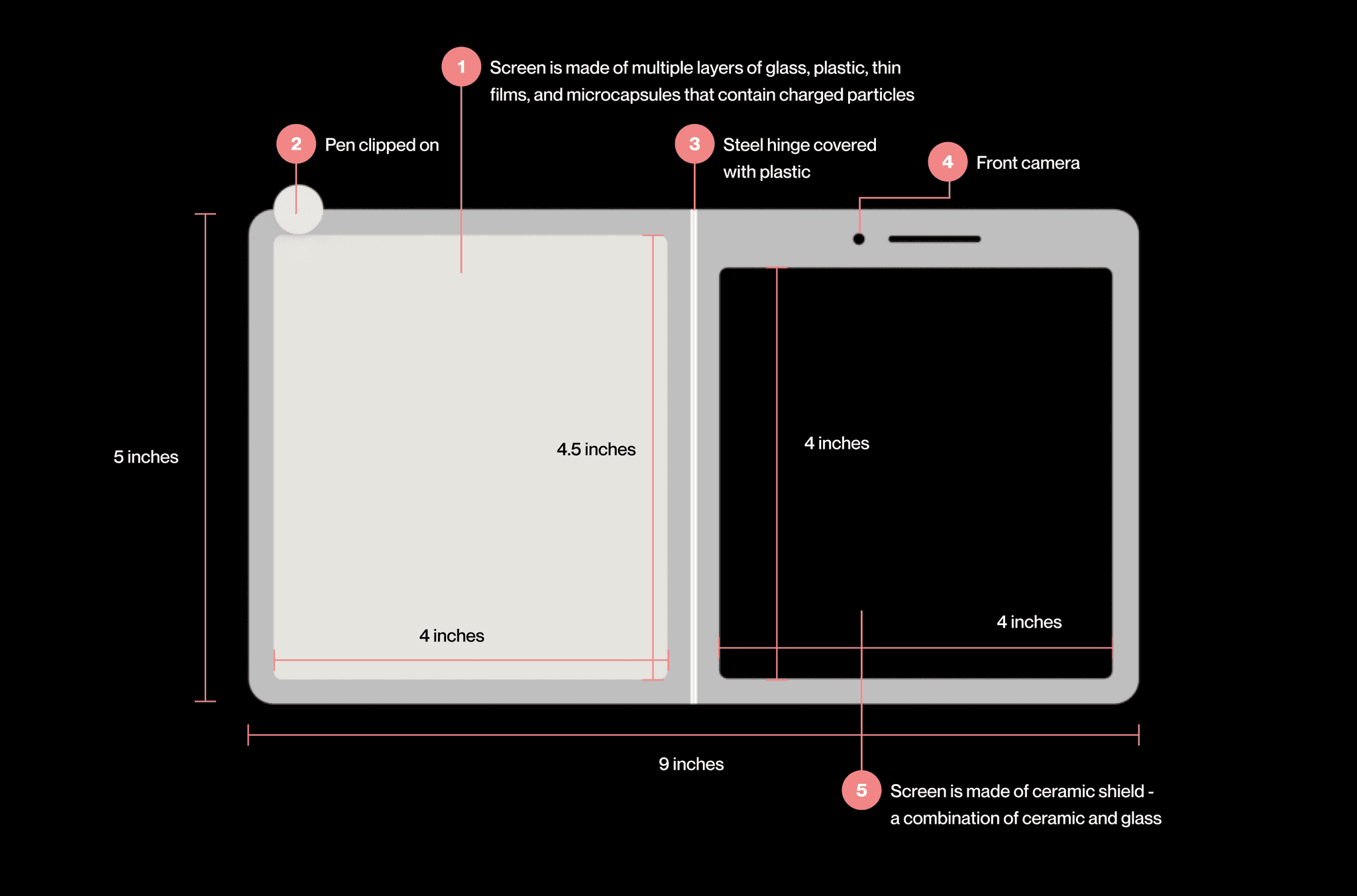
The Pocket Pad combines Kindle and iPhone design elements with durable materials. Its sticky-note dimensions and steel hinge enable portability while supporting core features.
Design

Retrospective